Примечание:
Эта страница - компонент, используемый на данной вики. Он предназначен для включения в другие страницы.
Страница, объединяющая все компоненты в единый список, расположена по ссылке: Хаб компонентов.
What this is
A component that displays a bunch of colored squares to show off a CSS theme's flair.
Designed by Woedenaz and componentised by Croquembouche.
This component is designed to be used for CSS themes, but it can be used on almost any page, if you really want.
Usage
On any wiki:
[[include component:theme-squares -=-
| color1-name=My Favourite Colour
| color1-variable=--fav-color
| color1-info=(191, 144, 0)
]]
Note the "-=-" after the component name. You do need to include that — otherwise all this text explaining how to use the component will appear on your page.
For this component, there are three parameters per color. Replace N with the number of the color.
A color can only be used if it's exposed as a CSS variable. All colors in a Black Highlighter theme have a corresponding CSS variable by default, so for BHL themes, this component should work out of the box. However, sigma9 does not use CSS variables, so the only CSS variables that are available will be any that you have defined in your theme.
This component can hold a maximum of 6 primary colors and 12 secondary colors. I recommend two primary colors and no more than six secondary colors.
To add a primary color, just add the top three of the above parameters to the include, as shown in the example.
To add a secondary color, it's the same, but replace 'color' with 'subcolor'.
Example
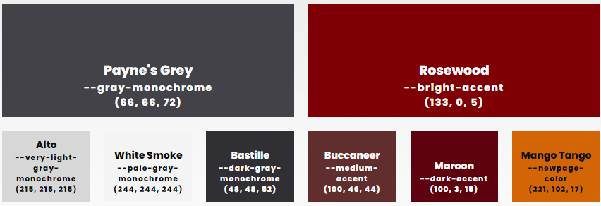
Here's a longer example, taken from the Black Highlighter theme:
[[include component:theme-squares -=-
| color1-name=Payne's Grey
| color1-variable=--gray-monochrome
| color1-info=(66, 66, 72)
| color1-has-light-text=1
| color2-name=Rosewood
| color2-variable=--bright-accent
| color2-info=(133, 0, 5)
| color2-has-light-text=1
| subcolor1-name=Alto
| subcolor1-variable=--very-light-gray-monochrome
| subcolor1-info=(215, 215, 215)
| subcolor2-name=White Smoke
| subcolor2-variable=--pale-gray-monochrome
| subcolor2-info=(244, 244, 244)
| subcolor3-name=Bastille
| subcolor3-variable=--dark-gray-monochrome
| subcolor3-info=(48, 48, 52)
| subcolor3-has-light-text=1
| subcolor4-name=Buccaneer
| subcolor4-variable=--medium-accent
| subcolor4-info=(100, 46, 44)
| subcolor4-has-light-text=1
| subcolor5-name=Maroon
| subcolor5-variable=--dark-accent
| subcolor5-info=(100, 3, 15)
| subcolor5-has-light-text=1
| subcolor6-name=Mango Tango
| subcolor6-variable=--newpage-color
| subcolor6-info=(221, 102, 17)
]]
This produces the following colored squares:

Tweaking
You can adjust the appearance of the component with CSS.
The whole component has the .colors-container class, and any CSS that targets it should included that class to ensure that nothing else on the page is affected. Every colored square has class .color. The primary colors have a .colors parent and the secondary colors have a .subcolors parent.
You'll need to use !important to override a square's background.
For example, the Laughter and Knives theme adds a gradient background to the 9th secondary color like so:
.colors-container .subcolors .color:nth-of-type(9) {
    background: var(--pastel-rainbow) !important;
}
Tool to convert existing syntax to arguments for this component

